Color is one of the most important factor when creating a design. It influences the way a viewer perceives what he or she is looking at. A multitude of studies have been conducted to show how important color is and the physiological effects it has on the human body. A recent study completes b y the Institute of Color Research revealed that people make a subconscious judgment about an environment or product within 90 seconds of the viewers initial glance. Additionally, they found that between 60-90% of that assumption is based on solely color. We as spatial designers give meaning to design, we do this by forging a growth of emotional response within a viewer. Whether you are designing a logo or an entire landscape we should always keep in mind a couple motifs when utilizing color theory. Amongst these motifs are psychographics, culture, trends, context and appropriateness.
Psychographics of Color
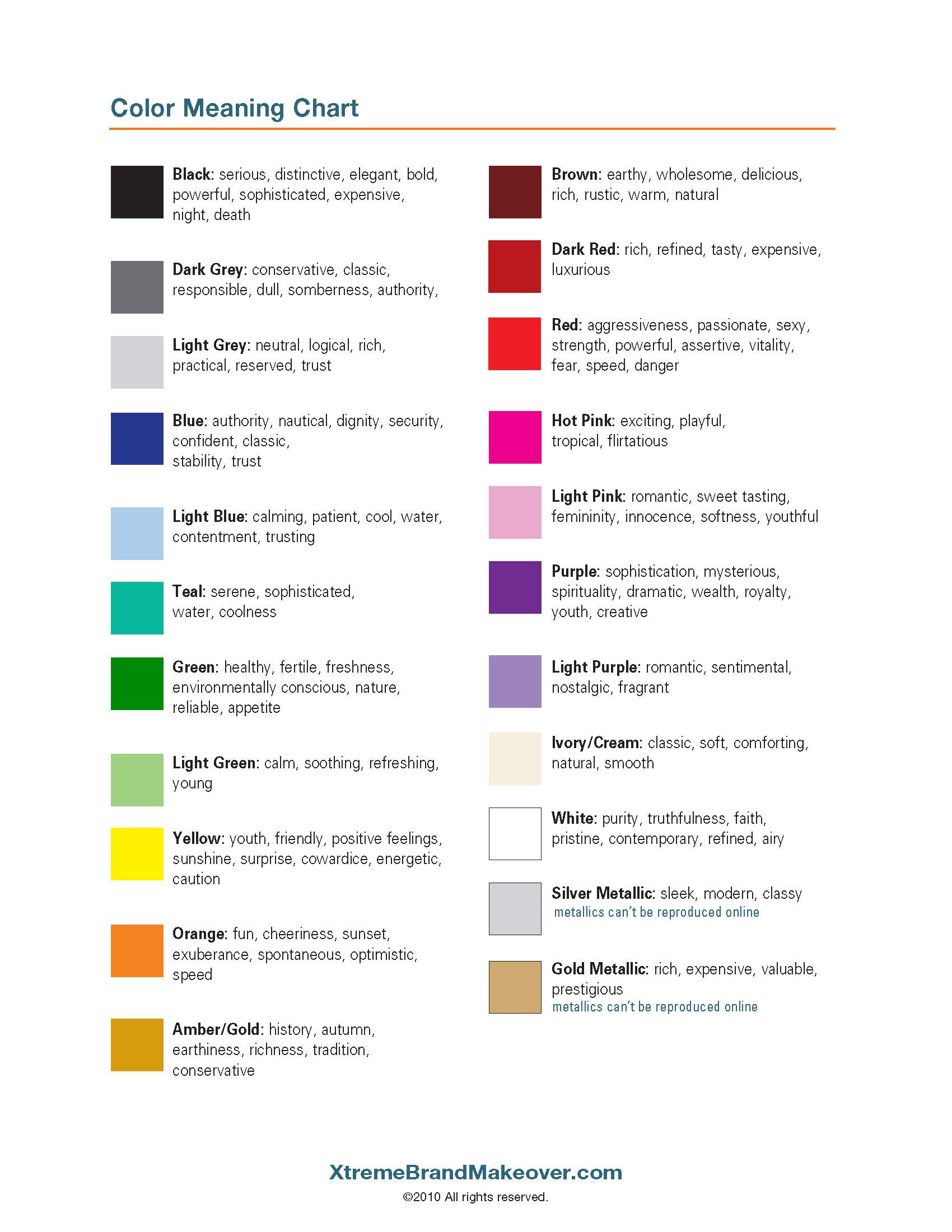
A humans perception has the propensity to be subjective, but a variety physiological effects using color are universal. Vibrant and warm colors like red and anything analogous invoke a feeling of passion, love, and aggression. Colors analogous to blue are often conveyed to be calming and inviting, hence why Facebook and Twitter utilize this color within their identity systems. Additionally, green is often tangentially connected with growth and life.
An effective use of color can be very effective and even increase conversions within a company. We can see this method utilized within a plethora of fast-food chains and restaurants. Food oriented brands have a tendency to bring warm analogous palettes that have a measurable [physiological effect on the body. The colors red, yellow and orange actually increase your heart rate and induce hunger.
Colors are often misconstrued to have contradictory emotional cues. For instance, green can mean sick or thriving. It is important when creating a palette to give the system the necessary context to properly inform your audience on what to feel. We call this, “pointed subjugation.”
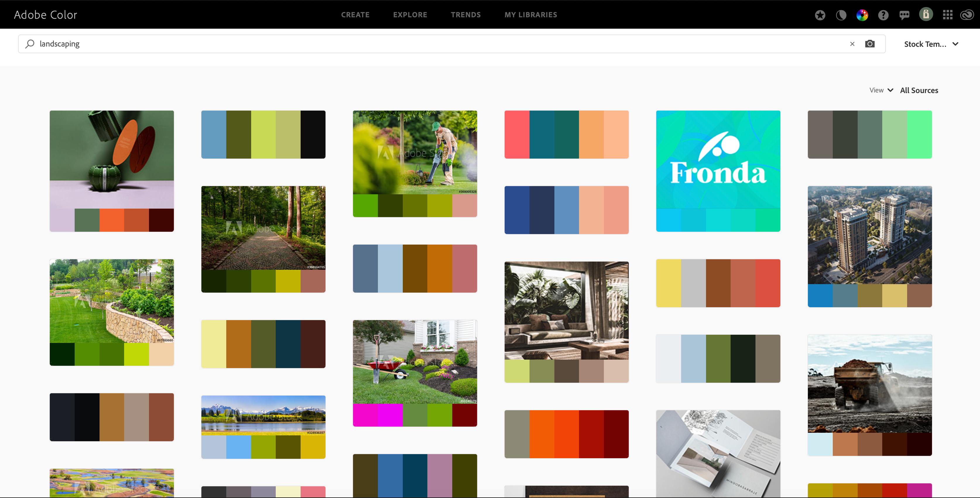
Pantone Colors
Pantones are widely recognized as the universal reference for picking colors. Whether you are screen-printing shirts, designing a logo or picking the proper plants, PMS colors are your source of reference. One of the most valuable resources is combining Pantone colors and Adobe Color. Adobe Color is one of the most useful tools on the market when trying to decide on the proper palette. All you have to do is type in an attribute you are trying to target and hundreds of variations are supplied to you when Pantone matches.